From Draumkvæde of 1904 to the type proofs of Gebr. Klingspor
Gerhard Munthe and the struggle for a typeface of the early Middle Ages
Book lovers from abroad may know Gerhard Munthe as one of the illustrators of the admired Norwegian edition of Snorri Sturlusson’s Heimskringla – Sagas of the Norwegian Kings («Snorre») from 1899. Draumkvæde from 1904, of which he answered for binding, illustrations and the hand-lettered text, is another remarkable work from Munthe’s hand. Attempting to design a typeface from the unique letterforms in this book, Munthe collaborated for several years with a German typefoundry.
By Torbjørn Eng
The history of the efforts for a Munthe typeface (Muntheschrift, as it was called) is of considerable interest for book and typography enthusiasts. Until my research in the mid 1990s, this story had not been investigated in detail.
With the Gerhard Munthe (1849–1929) exhibition in Norway’s National Gallery in 2018, this unfinished typeface project will hopefully come to the knowledge of many more art and book lovers. The history of the Munthe typeface is covered in Jan Kokkin’s Gerhard Munthe – Norwegian Pioneer of Modernism (Arnoldsche Art Publishers 2018), a beautiful book accompanying the exhibition. The present article tells the story more in detail than Kokkin’s book, has many more illustrations and has some different points of view.
A piece of art
Most chronicles of Norwegian book history have included the publication of Munthe’s Draumkvæde, with good reason. The binding as well as the title pages (there are two), text pages and illustrations make it into an outstanding book. It has been characterized as a piece of art more than a book.
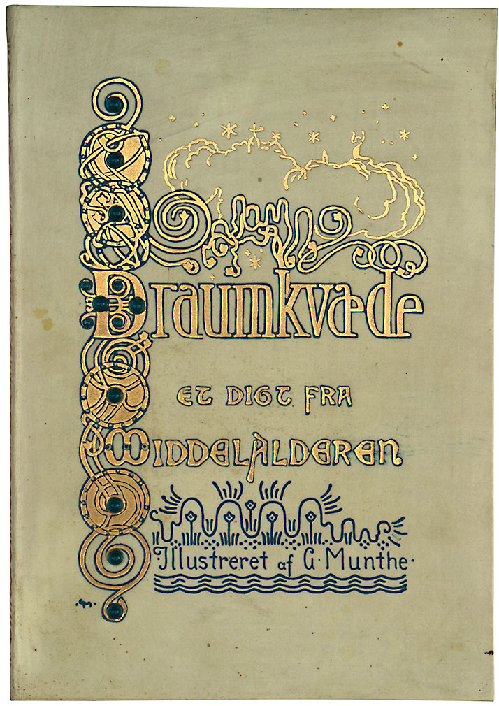
The imitated vellum binding of Munthe’s Draumkvæde was executed by master bookbinder H. M. Refsum in Christiania (Oslo). Munthe had problems getting hold of the blue glass pearls that are embedded in the cover. In the end they were ordered from Germany. They had a tendency to fall out, according to some critics. But they are still in place in my copy of the book, also on the back.
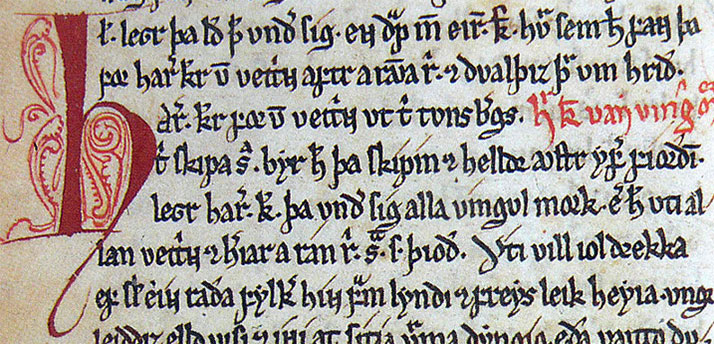
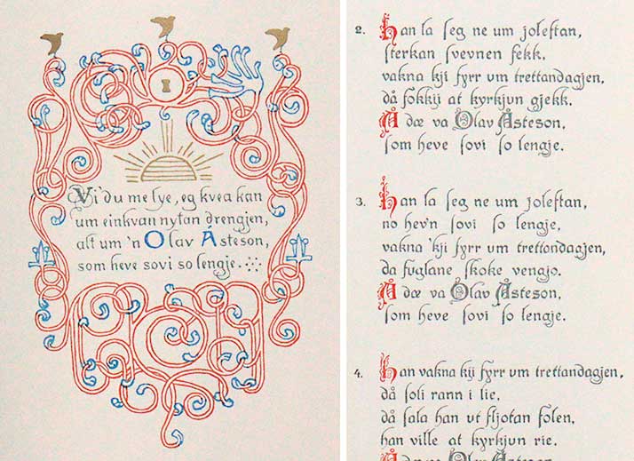
The binding, executed by the bookbinder H. M. Refsum, is an imitation of vellum, with insets of blue glass pearls. The reproduction of Munthe’s illustrations was a pioneer work in Scandinavia. The etcher Wilh. Scheel & Co. brought in a skilled etcher from abroad, in order to colour separate the water colour illustrations, which were printed in up to six colours, among them gold. The text is hand drawn with richly decorated, calligraphic blackletter letterforms, executed by the artist Aug. Sørensen in accordance with Munthe’s models.1 Draumkvæde was printed by W. C. Fabritius & Sønner in Christiania, today’s Oslo. It has 30 pages, and was printed in around 300 copies. Most of them were distributed to the members of the publisher, Forening for norsk bokkunst (The Norwegian Book Arts Society), as the book was not in regular sale.
The printing revival
At the turn of the 19th and 20th century there were many who argued for a tighter cooperation between artists, craftsmen and industry. The Englishman William Morris was a forerunner in this in the printing trade. Influenced by the output from his printshop, Kelmscott Press (1891–1896), in many countries there were efforts to raise the standards of the art of printing.
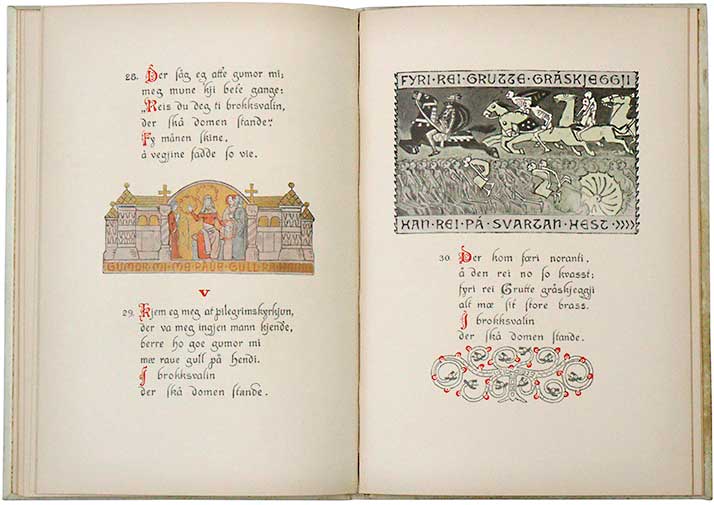
A Draumkvæde spread. There are altogether 51 verses.
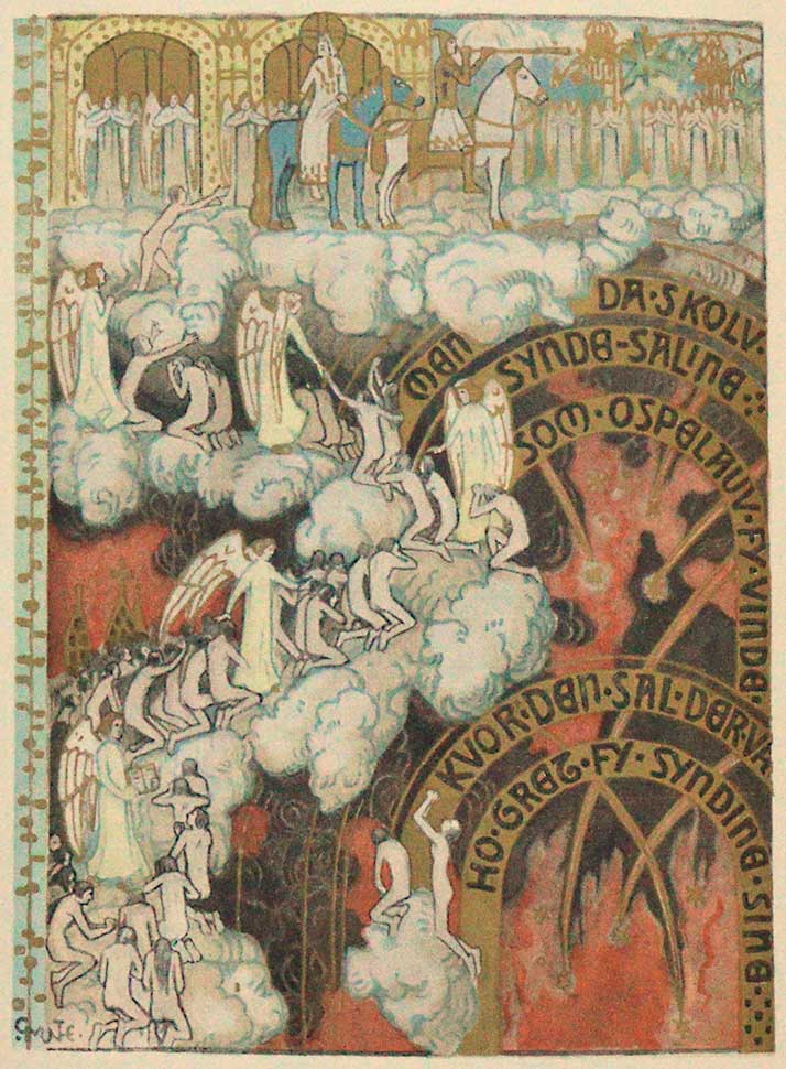
The «Day of Judgement» illustration in Draumkvæde.
The Norwegian Book Arts Society was established in 1900. In accordance with the national sentiments in the years ahead of the dismantling of the political union between Norway and Sweden in 1905, it was natural to choose the medieval folk song/poem Draumkvedet to be its first publication. This was because it was regarded as genuine Norwegian song, and not brought in from foreign countries – like most other folk songs.
The publication of Snorre a few years earlier, in 1899, was a great achievement for the Norwegian book trade. This voluminous book is illustrated by several Norwegian artists in a pen-drawn black and white style, imitating woodcuts. Gerhard Munthe established this illustrative style for all the involved artists. As well as contributing with a large number of the illustrations and all the vignettes, he was also responsible for the binding, the title-page and the choice of a blackletter typeface as best suited for the 700 year old sagas.
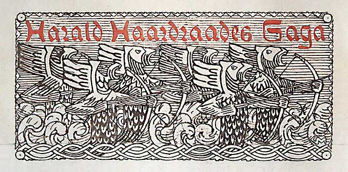
The opening vignette of the saga of king Harald Hardrada – one of Gerhard Munthe’s many vignettes, illustrations and ornamentation in Snorre (1899).
His work with Snorre established Gerhard Munthe as Norway’s most prominent book artist. For several years he had worked to develop a unique Norwegian decorative art. He was the natural choice for illustrating the mystical, religious Draumkvedet (English: «Dream Song») for the Book Arts Society, where he also was a member of the board.
Initially the plan was to publish the poem and the illustrations together with an explanation of Draumkvedet, to be written by the folklorist Moltke Moe. But while Munthe presented his illustrations to the members of the Book Arts Society in February 1901, less than a year after the society was founded, Moe’s text did not materialize. His deadline was prolonged several times, while Munthe’s impatience grew. In the end it was decided to publish Moltke Moe’s text separately later.2
At last, in December 1904, Draumkvæde was finished from the printer and bookbinder. (Draumkvedet is spelt Draumkvæde in Munthe’s publication.) The book was met with interest both nationally and internationally, and has been admired as well as criticized, well into our own time.
Munthe himself was doubtful when presented with the final product. Only a week after publication he contacted the Dane Emil Hannover, later director of the Museum for applied arts in Copenhagen, asking for his honest opinion. Hannover’s verdict of the handwritten script is worth citing:
«Now I will turn to a part of the book, which I without reservation will praise. That is the script. It is well executed in its style, of one and the same sort all through; I haven’t found a single letter in the whole alphabet, which I would have wanted differently. I know and can judge the difficulties you have overcome; nobody has in recent years done this better; hardly anybody has done it as well. But I would have liked a tighter expression of the script. The gaps between the words here and there removes some of its strength. Maybe the colour of the ink is partly to blame for this.»3
The letters
The hand-drawn text was by some commentators of the printing trade looked upon as a dead end, taking into consideration the purpose of the Book Arts Society, which was to advance the crafts in the printing industry. The compositor was in this case made redundant! In response, the board of the Society declared that their next publication should be a typographic product.
The letterforms in Draumkvæde were based on Munthe’s knowledge of Nordic medieval manuscripts of the 13th century, especially the saga manuscript Codex Frisianus. Written in Norway, but from the 15th century in Danish ownership, Codex Frisianus is highly esteemed for its beautiful lettering and many big, coloured intial letters.
From Codex Frisianus, part of the saga of king Harald Hårfagre. (Wikimedia Commons)
The letterforms in Draumkvæde have a blackletter (gothic) character. The ascenders and descenders have long, calligraphic swashes (e.g. f and j). Some letters are most unusal (e.g. p). The capital letters are ornamented, inspired by the illuminated initial letters of medieval manuscripts, and printed in red. As was the case with the medieval initial letters: some have a roman character, others have a blackletter character. We will come back to this detail several times in the following.
So far about the publication of Draumkvæde. Most of the information above has been known from other sources. But art historians had not, until my research in the early 1990s, looked into the efforts to make a typeface out of Munthe’s letterforms in Draumkvæde.
German interest in the letterforms
As Gerhard Munthe sat impatiently worrying about the repeated delays in the publication of Draumkvæde, and his creativity longed for illustrating other folk songs, in December 1903 he was visited by a friend, Friedrich Deneken (1857–1927). He was director of the Museum for applied arts in Krefeld, Germany – Kaiser Wilhelm Museum.
According to Deneken’s letter to the type founder Karl Klingspor, written after his visit, Munthe had shown him the script of Codex Frisianus, but I believe that it must have been Munthe’s interpretation of them; that is to say the script in the already printed Draumkvæde. Munthe asked Deneken if he knew somebody in Germany who would be interested in producing a typeface from the letterforms. Such a typeface would be needed for his planned publications of other Norwegian folk songs.4
Deneken was an admirer of Nordic art as well as of Munthe.5 He descended from the former Danish district of Schleswig Holstein, and was fluent in Danish. He inquired with the type foundry Rudhard’sche Schriftgiesserei (from 1906 called Gebr. Klingspor) in Offenbach am Main. This type foundry was under the direction of Karl Klingspor (1868–1950), a type and lettering expert who Deneken had met earlier.
Rudhard’sche Schriftgiesserei was one of the first type foundries to engage artists in order to design new typefaces. This had proved a success with Otto Eckmann’s art nouveau typeface Eckmann-Schrift (1900).
Karl Klingspor’s evaluation of the letterforms
Karl Klingspor was interested, as Munthe’s art already was known to him. He responded positively to the printed examples he had received, and wrote back to Deneken: «I like this script exceptionally well, and I regard it as an exciting challenge to make a really fine typeface on the basis of this material.» But, he added: «This project is not as simple as Munthe seems to think.»
Gerhard Munthe’s sketch of his script as they were sent to Karl Klingspor in 1904. On photographic paper in Munthe’s archive in The National Library in Oslo, the capital letters measure only 10 mm high, but they have probably been reduced photographically from the original, which was sent to Klingspor. Still, they must have been as small as between 15 and 20 mm high. The letters are drawn very roughly. The small text on top says: «These letters (the capitals) will be modestly ornamented (see «Draumkvæde»). The different forms (the older (the roman) and the younger, gothic) will alternate. Therefore they must all be available.»
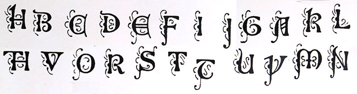
Munthe also sent Klingspor these drawings of the ornamented (swash) capitals for his planned typeface. They are an important part of the personality of his script. «With these, my plan is good, and I will not change it», he told Deneken.
Karl Klingspor pointed to the complicated work to transform a drawn script with all its variations into a functional typeface. In a typeface, each character usually has only one design, and each must combine well with all the other characters. He also pointed to a number of «kerns» (overlaps) in the Draumkvæde alphabet: that is, parts of the letterform extending beyond the supporting metal piece into the neighbouring character’s area (e.g. d and l). Note: today the concept of kerning is something different, though related: the possibility in digital fonts to reduce or increase the spacing between characters in certain problematic combinations, like T and o, in order to produce more even text.)
With the technology of the time (i. e. handsetting of metal pieces of type) kerns were possible, but would complicate the setting as well as the printing. A letter combination involving a kern is often solved by making the two letters into one piece of type, a so-called ligature. Alternatively, if made into separate pieces of type, the very thin kern could easily break during printing (see the following illustration). So Klingspor wanted to reduce the number of kerns as much as possible.6
He was also sceptical about the capital letters, which he felt did not harmonize with the lowercase letters. In his opinion the lower case letters were of blackletter (gothic) origin, while many of the capital letters had a roman character. As we can see from the written comments on the sketch of the alphabet above, Munthe was well aware of this. This was inherent in the personality of the script.
Klingspor’s objections to the capital letters were mentioned for the first time in March 1904, but were outlined in detail a year later: «We will once again speak about the capital letters, and must ask you not to be angry with us. Based on our experience and the proofs, we think that the typeface will profit if the capital letters, which have a certain roman form and chisel-ductus, are changed to be closer to the lower case letters, which have gothic brush-ductus.»7
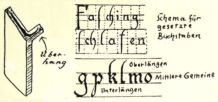
Karl Klingspor felt he had to explain basic typography to Gerhard Munthe. In his illustration on the left we see how the overlapping swash to the right of the character l (lowercase L) will appear in typography with moveable type, if not cut into a piece of type in combination with other letters (a ligature). This so-called «kern» (Überhang in German) could easly break during printing, so Klingspor wanted as few as possible of them, though they were central to the personality of the alphabet.
His objections were repeated again and again the following years, but Munthe was unwilling to make changes. He was an artist, while Karl Klingspor was a practical man who also had great knowledge about script and typeface history. Munthe based much of his decorative art on past forms, but gave them a free, personal touch. In addition to this, his knowledge of typefaces was insufficient. He had unrealistic expectations about how soon the typeface could be finished, and supplied Klingspor with only the inaccurate sketch of his alphabet, shown above.
On the other hand, Munthe made it clear from the start that he was not able or had time to get involved in the details of the process. But if Munthe had accepted Klingspor’s invitation to visit the type foundry in Offenbach in the summer of 1904, their cooperation might have had another and better outcome.
In addition, Munthe was very determined and unwilling to compromise: «I will not approve of anything which contradicts my strong feelings for the style and thinking (of the 12th and 13th century).» He asked Deneken to tell Klingspor that «I know exactly how I want these types to be» (Munthe’s emphasize). Responding to the problem of overlaps, he wrote: «Of course I have been aware of the kerns of certain letters. But to leave these out would destroy the soft and artistic character of these types.»8
In March 1905 Munthe received the first proof, of 14 letters. As mentioned above, the type foundry in their letter repeated their concern that it was a contradiction between the uppercase (capital) and lowercase letters. But to Deneken, the middle-man between Klingspor and Munthe, Klingspor wrote in earnest: «...his creative power does probably not stand up to the task...» (of redrawing the capital letters).9
Karl Klingspor’s questioning Munthe’s creative power as a lettering artist is interesting. A close study of Draumkvæde reveals that the first verse of the song is drawn in a slightly diverging, simpler and less decorated letters than the following verses. I believe that only the text on this page is drawn by Munthe personally, so that artist Aug. Sørensen has been more decisive to the resulting script in Draumkvæde than presumed. The first verse also shows similarities with other lettering from Munthe’s hand, not found in the following verses (the letter A is characteristic of Munthe).
Left: the first verse of Draumkvæde, with lettering of a bit different character than the rest of the book, in particular V, O and A. Right: the following verses with decorated O and A in a blackletter (gothic) style, and more elaborate lowercase characters. I think it is possible that only the text of the first verse was drawn by Munthe personally.
For a long time Munthe did not hear from Klingspor, and grew impatient. In October 1905 he wrote to Deneken: «When (...) I only after long, irregular pauses hear about how it develops, I find it difficult to maintain my interest.»10 Friedrich Deneken also repeatedly asked Klingspor for progress in the project.
During the winter 1905/1906 Munthe stayed in Paris. He wrote to Deneken that he «was studying the oldest gothic style, with the Norwegian folk songs on my mind...»11 Obviously, Munthe was still in need for his typeface. Klingspor tried to arrange for his Paris representative to meet Munthe, but did not succeed, maybe because of Munthe’s change of addresses.
Then, in March 1906, as Munthe was on his way from Paris back to Norway, they arranged to meet on the train. They travelled together from Cologne for an hour and discussed the typeface. Klingspor probably repeated his objections to the mix of blackletter (gothic) and roman letterforms, because following this meeting Munthe revised a few of the letters. But he was reluctant to do this, and in a letter to Deneken he put his trust in the many good reviews of the Draumkvæde script: «...and I have seen nothing but unconditional appraisal (from experts and book art magazines). (...) In Paris I also received only praise for ‘having perfectly solved the difficult task of designing a script for the 13th century’».12
In March 1907 Munthe wrote to Deneken: «I no longer believe in the otherwise amicable Mr. Klingspor.» Munthe added that he could have offered his script to another type foundry – «...for example through my French friends in Paris».13
Then, in October 1907, Munthe received a proof which showed an almost complete alphabet of the lowercase letters, and seven uppercase letters. «It is just wonderful! – but why doesn’t he ever finish it», Munthe wrote to Deneken, and added: «It is sad that I didn’t go to another company (i.e. type foundry), which would have produced the typeface immediately. It will be many years old before it is finished. Maybe it will be stolen from Draumkvæde before then? I think this is very unfair of Klingspor. You have to tell him, it is of no use in me speaking to him.» (Munthe’s emphasize.)14
An incorrect, but resembling verse from Draumkvæde, typeset with the unfinished Muntheschrift by Gebr. Klingspor, dated 30.10.1907 and sent to Gerhard Munthe. Their objective with this proof must have been to compare the progressing work to the original. Capital O and Å had not been cut yet. Interestingly, we can see that Klingspor did cut a few of the ornamented capitals, here G and A. The intricate detailing did not represent a technical problem.
New contact with Gebr. Klingspor
The following couple of years Deneken repeatedly pressed Klingspor for progress, while Munthe was busy with a large interior design project in Bergen, Norway – the medieval, gothic Håkonshallen.
At one point the typeface project did take steps forward. In the autumn of 1909 Klingspor wrote to Deneken: «...we have taken up the Munthe typeface again and have cut it completely new. One size of the ornamented (swash) capitals is finally finished, and another size will be started.»15 But it seems that Munthe was not informed about this, and that new proofs were not sent, neither to Deneken nor Munthe.
But as Munthe later resumed his work with the folk songs, so close to his heart, he again felt the need for an appropriate typeface. The winter of 1916 he asked the prominent Oslo printer Max Rich. Kirste, of German origin, to contact Gebr. Klingspor about the forgotten work.
Klingspor replied that the typeface was almost finished, but that they had started to doubt whether they were on the right path. The work had been set aside and subsequently forgotten. They were now willing to resume the work, if Munthe approved of the two proofs enclosed.16
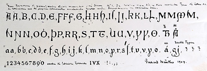
These proofs, dated 1910, which Munthe had not yet seen, show that the typeface had come a long way towards completion. It was cut in two sizes (cicero, 12 point; and tertia, 16 point), and was named «Muntheschrift».
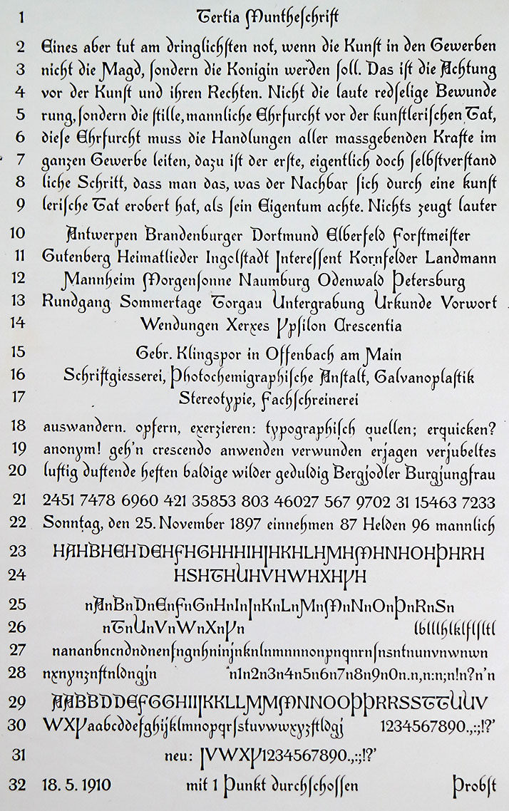
In 1916 Munthe for the first time saw these proofs, dated 1910. They were sent him through his new middleman in the contact with Gebr. Klingspor, the Oslo-based printer Max Rich. Kirste. In this proof, no ornamented capital letters are included. The problem of kerns is solved by cutting three ligatures: ft, ld and gj are each produced as a single piece of type (see the third last line).
Klingspor asked Kirste, the new middleman, about his opinion. Kirste’s answer to Klingspor was, according to what he told Munthe in a separate letter: «I think the lower case letters are really good, and so also most of the uppercase letters.» But he objected to H, N and P, which did not harmonize with the lower case letters. His point of view resembles Karl Klingspor’s.17
Munthe, in a letter to Kirste thanking him for help, went into detail defending his alphabet, and among several arguments referred to Emil Hannover’s praise of the Draumkvæde script in 1905 (see above).18
Nevertheless, following Kirste’s advice, Munthe redrew three capital letters. And in order to convince Klingspor, he once again cited the positive reception of the script in Draumkvæde, when published in 1904. He also acquired a statement from the University of Christiania (Oslo), which confirmed that the script was based on Nordic medieval manuscripts. Munthe suspected that Klingspor’s objections were based on lack of knowledge of these manuscripts.19
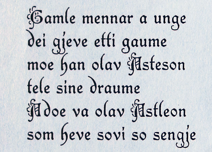
But to our knowledge no further efforts were made to finish the Muntheschrift. Munthe kept on working with the folk songs, and again the text had to be drawn by hand, this time with a rather ordinary script. They were published as Norske folkeviser posthumously in 1933.
In 1944 Gebr. Klingspor type foundry was bombed during an allied airstrike and was completely destroyed, along with all its Muntheschrift material. The Klingspor-Museum of today has been practically unaware of the Muntheschrift.
Why was Muntheschrift not finished?
One reason may be Karl Klingspor’s objections to the roman character of the uppercase letters. Personally, I think Munthe’s interpretation of the historical models has some merit. A mixture of roman and gothic traits is evident in the medieval manuscripts.
It is also interesting to note that two decades later, Gebr. Klingspor launched two typefaces, Wallau (1925) and Peter-Jessen-Schrift (1931), with blackletter lowercase and roman uppercase types. To this Karl Klingspor had objected strongly with the Muntheschrift.
It is relevant to question whether is was a commercial market for such an early medieval typeface. Maybe it was a demand for it in 1904, when William Morris, the private press movement, historical styles and the art nouveau style was at its peak of popularity, but certainly less so in the following decades.
It did not help that Munthe supplied the foundry with less than satisfying drawings, and that he did not enter a close relationship with it in order to listen to the technical side of the project. Maybe he also was a bit stubborn – as he wrote in 1906 about his alphabet: «It will be as I have meant it to be, and as it must be – in order to fill a lacuna.»20
The Oslo printer Kirste mentions briefly the Muntheschrift in a book in 1943, and blames the economical downturn after the First World War for its dire destiny. This may well have played a part, but Klingspor had by then been in doubt for 15 years. Commentators with knowledge of Karl Klingspor say it was unusual of this man not to complete a work which had progressed so far.
But Munthe’s and Klingspor’s work has nevertheless been completed later on. The Oslo printer Fabritius, which printed Draumkvæde in 1904, initiated their own, rather different, but from Draumkvæde inspired, version of the script. It was finished as Fabritius-skriften in 1962, for Monotype typesetting. And thirty more years later, after researching the story of the Munthe typeface, I made my digital version of it, based on Munthe’s sketches and the Klingspor proofs, but with changes and additions. It was finished as Frisianus in 1994, and relaunched as FrisianusOT in 2011. It has been a moderate success, being used in packaging, in advertising, on book covers and more.
NOTES
1. August Sørensen was engaged probably because Munthe’s hand was injured. Letter from Munthe to Friedrich Deneken, November 21th, 1901 (Kaiser Wilhelm Museum, Krefeld).
2. Moltke Moe’s explanation was never published. Parts of it were
typeset, and waited for completion for a long time until the printer had to use the type for other purposes. Hermann Scheibler of the printer Fabritius, before redistributing the type, printed a proof of it, which he donated to the National Library, Oslo.
3.Wilhelm Munthe: Boknåm. Oslo 1943. Page 100.
4. Letter from Deneken to Karl Klingspor February 26th, 1904. (Kaiser Wilhelm Museum, Krefeld)
5. Deneken to Munthe September 30th, 1902: «You know how highly I appreciate your personal style, and wish that it finds a deserved recognition in and outside of Norway.» (National Library, Oslo)
6. Klingspor to Deneken March 23rd, 1904. (Kaiser Wilhelm Museum, Krefeld)
7. Rudhard’sche Giesserei to Munthe March 10th, 1905. (National Library, Oslo)
8. Munthe to Deneken March 31st, 1904 (Kaiser Wilhelm Museum, Krefeld)
9. Karl Klingspor to Deneken March 20th, 1905. (Kaiser Wilhelm Museum, Krefeld)
10. Munthe to Deneken November 8th, 1905. (Kaiser Wilhelm Museum)
11. Munthe to Deneken from Paris February 9th, 1906. (Kaiser Wilhelm Museum)
12. Munthe to Deneken March 25th, 1906. (Kaiser Wilhelm Museum)
13. Munthe to Deneken March March
16th, 1907. (Kaiser Wilhelm Museum)
14. Munthe to Deneken November 9th, 1907. (Kaiser Wilhelm Museum)
15. Klingspor to Deneken, autumn 1909: unclear month. (Kaiser Wilhelm Museum)
16. Gebr. Klingspor to Kirste & Sieberth March 17th, 1916. (National Library, Oslo)
17. Kirste & Sieberth to Munthe, March 30th, 1916. (National Library, Oslo)
18. Munthe to Kirste June 1st, 1916. (National Library, Oslo)
19. Munthe to Gebr. Klingspor, unclear date. (National Library, Oslo)
20. Munthe to Deneken, March 25th, 1906. (Kaiser Wilhelm Museum)
NORWEGIAN SUMMARY
Dette er en nyskrevet versjon av historien om Draumkvæde og Muntheskriften, med nye momenter i forhold til de tre andre jeg har publisert tidligere. Den er ment for en internasjonal leserkrets. Jeg har publisert en noe kortere norskspråklig versjon av historien her.
Først publisert 21.06.2018
Sist revidert 27.08.2024
Above: a section of a Klingspor-proof of Muntheschrift, dated 1910.
UNCOVERING THE STORY
For many years, the full story of the Munthe typeface was unknown.
The printer Max Rich. Kirste in Oslo left a track of it in his Trykksakboken (1943): he printed a reproduction of the 1910 proof from Gebr. Klingspor (shown below), with an explanation in seven lines of text.
Hilmar Bakken in his Gerhard Munthes dekorative kunst (1946) went more into detail, as he had read Munthe’s correspondence in the university library in Oslo. One page was set aside for the Muntheschrift, but with no illustrations of Munthe’s sketches or Klingspor’s trial cuttings in regards to the planned typeface.
In 1984 Morten Svendsen in Bergen sent the Klingspor-Museum a copy of the illustration in Kirste’s book, asking for information. On the basis of this contact, the Munthe-Schrift is briefly mentioned in Halbey: Karl Klingspor – Leben und Werk (1991).
In the early 1990s I decided to research the story in detail. Among various sources, I believe that I was the first to study the correspondence between Gerhard Munthe, Friedrich Deneken and Karl Klingspor in Kaiser Wilhelm Museum in Krefeld, Germany.
I then published the history of the Munthe typeface in Norsk Grafia no. 8 and 9 1994 and in Norsk Grafisk Tidsskrift no. 12 1994 and no. 1 1995. These articles are almost identical. Later I published a typographically less technical version of the history in Bokvennen no. 4 1996.
The great Munthe exhibition in Norway’s National Gallery in Oslo 2018 does not include the Munthe typeface story. But it is covered in the fine, thorough book published for the exhibition: Jan Kokkin’s Gerhard Munthe – Norwegian Pioneer of Modernism (Arnoldsche Art Publishers 2018).
The present article, for the first time in English on Typografi i Norge, is an extended version of my history of the Munthe typeface, combining my previous articles with new information. I hope it will reach an international readership following the Munthe exhibition and Jan Kokkin’s new book. It tells the story more in detail than Kokkin’s book, has many more illustrations and has some different points of view.